Mobile-First Indexing in 2026: A Content Parity Checklist
Ammar
AI Specialist
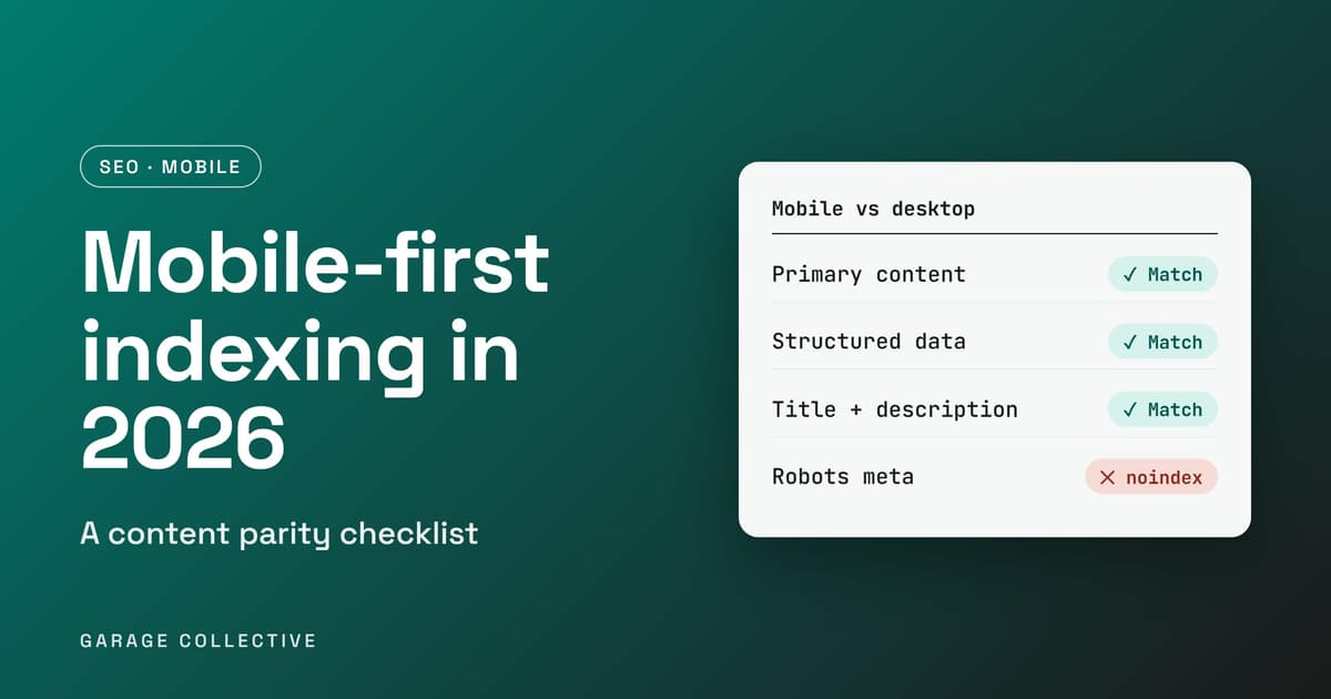
Here is the sentence that should change how you audit your site: Google uses the mobile version of your content, crawled with its smartphone agent, for indexing and ranking. That means the page you check on your desktop monitor is not the page Google judges. If your phone layout hides a section, drops your structured data, or carries a stray noindex, that is the version that counts. Google's own guidance on mobile-first indexing is practical and short. This post turns it into a content parity checklist, with extra rules for sites that still run separate mobile URLs, and a quick audit you can finish in a coffee break.
What mobile-first indexing means
Google uses the mobile version of a site's content, crawled with its smartphone agent, for indexing and ranking. A mobile version is not required to be included in Search, but Google says it is very strongly recommended. The simple rule that follows: whatever is missing from your mobile page is missing from Google's view of your page.
Which setup do you have?
Google describes three ways to serve mobile users. Check which one is yours, because the specific checklist below matters most for the last two.
| Setup | How it works | Google's view |
|---|---|---|
| Responsive design | One HTML version at one URL, displayed differently by screen size | Recommended as the easiest to implement and maintain. Content and metadata are already identical |
| Dynamic serving | Same URL, different HTML depending on the user agent, using the Vary: user-agent header | Needs the parity checks below |
| Separate URLs (m-dot) | Different HTML on different URLs, with device-based redirects | Needs the parity checks below, plus extra rules |
The content parity checklist
These are the points from Google's guidance for sites where the mobile and desktop versions can differ:
• Primary content. The mobile version should carry equivalent primary content. Accordions and tabs are fine for reducing clutter as long as the content is still there. Use the same headings on both versions.
• No hidden-behind-action content. Do not lazy-load primary content behind user actions such as swiping, clicking or typing.
• Robots meta tags. Use the same ones on both versions. A noindex or nofollow that appears only on mobile can cause problems.
• Blocked resources. Do not block images or scripts with robots.txt, and use the same robots.txt rules for both versions.
• Titles and descriptions. Keep title elements and meta descriptions equivalent.
• Structured data. Include the same structured data on both versions. Google prioritises Breadcrumb, Product and VideoObject. Update any URLs inside the mobile markup to the mobile URLs.
• Ads. Follow the Better Ads Standards. Ads that take up too much of the mobile screen hurt the experience and can affect ranking.
Images and video on mobile
Use high-quality images in supported formats, and keep alt text, titles, captions and filenames consistent across both versions. Avoid image URLs that change on every page load. Google warns that using different image URLs on mobile may cause a temporary loss of image traffic. For video, use supported formats in standard HTML tags such as
Extra rules if you run separate mobile URLs
If your mobile site lives on something like m.example.com, Google adds these:
• Keep error page status consistent across both versions.
• Avoid URL fragments on mobile pages, since they generally are not indexable.
• Do not redirect different desktop pages to the same mobile URL, such as the mobile homepage.
• Verify both versions in Search Console.
• Pair hreflang links within each version, so mobile URLs point to mobile URLs and desktop URLs to desktop URLs.
• Make sure the mobile server can handle a possible increase in crawl rate.
• Use a desktop canonical: the mobile page canonicalises to desktop, and the desktop page declares the mobile version as an alternate with a media query.
How to test
Google points to two tools. Search Console lets you verify both versions and view their data and messages. The URL Inspection tool is recommended for checking that structured data and content show up on the rendered page. Google's page says nothing more about Core Web Vitals or page speed, so treat speed as a separate job, and see our guide to passing LCP, INP and CLS.
A 15-minute mobile parity audit
• Work out which setup you use: responsive, dynamic serving or separate URLs.
• Open your key page on a phone and on desktop. Compare headings, body copy and product details side by side.
• View the source or use URL Inspection and confirm the same robots meta tags, title and meta description on both.
• Check your structured data on the mobile version, especially Breadcrumb, Product and VideoObject.
• Confirm robots.txt is not blocking images or scripts, and that tabs and accordions still contain the full content.
• If you have separate URLs, verify both in Search Console and check the canonical and alternate tags.
If you run an online store, our D2C landing page CRO audit is a useful companion for the conversion side of landing pages.
FAQ
Do I need a mobile version to be in Google?
No. A mobile version is not required for inclusion in Search, but Google says it is very strongly recommended, since it indexes and ranks using the mobile version.
Which mobile setup does Google recommend?
Responsive design. It serves one HTML version at one URL, displayed differently by screen size, and Google calls it the easiest to implement and maintain.
Can I use tabs and accordions on mobile?
Yes. Google says they can help reduce visual clutter without removing content. The content itself should still be there, and primary content should not be lazy-loaded behind actions such as swiping, clicking or typing.
Does structured data need to be on mobile too?
Yes. Include the same structured data on both versions. Google prioritises Breadcrumb, Product and VideoObject, and says to update URLs in mobile markup to the mobile URLs.
What goes wrong most with separate mobile URLs?
Google's list includes mismatched robots meta tags, blocked resources, missing structured data, different error statuses, and redirecting different desktop pages to the same mobile URL.
Like what you're reading?
Get a free marketing plan tailored to your brand
Get Your Free Planyes, actually free. we're not kidding.
Key Takeaways
- Google indexes and ranks using the mobile version of your content.
- Responsive design is the simplest setup, because content and metadata are already identical.
- On dynamic serving or separate URLs, match content, headings, titles, descriptions and robots tags on both versions.
- Include the same structured data on mobile, especially Breadcrumb, Product and VideoObject.
- Do not block images or scripts, and do not hide primary content behind swipes, clicks or typing.
the TL;DR your boss will love
This Isn't Just Theory. We Do This Daily.
Let us show you exactly what we'd do for your brand - strategy, channels, budget, timeline. Free. No pitch deck.
Get Smarter Every Week
Ideas, data, and the occasional hot take. Biweekly, no spam.
we promise not to sell your email to robots
You Might Also Dig These
^ we picked these just for you (okay, the algorithm did)
Google's October 2026 AI Content Guidance: SEO and E-E-A-T Checklist
Google updated its guidance on generative AI content on 1 October 2026, aligning the documentation more closely with its Search Quality Rater Guidelines. The update does not create a special ranking system for AI-written pages. It sharpens the standard that matters: content should serve a clear audience, demonstrate real expertise and make factual claims easy to verify. For Indian marketing teams using AI at scale, the operational question is no longer whether AI may be used. It is whether every published page adds original value, accountable authorship and dependable evidence.
ReadIndia Festive Commerce Playbook 2026: D2C, Quick Commerce and Always-On Growth
India’s festive season remains a major commercial opportunity, but e-commerce demand is no longer limited to a few sale events. NIQ describes a market shaped by both habitual purchases and event-driven peaks, while Meta points to video-first discovery, creators and messaging-led commerce. A useful festive plan connects demand forecasting, channel roles, creative and customer experience from discovery through repeat purchase.
ReadUltimate Guide to AI-First Agency Month: Optimize Performance Marketing ROI Amid Rising Ad Costs in India
Struggling to keep up with rising ad costs and ever-changing Google and Meta algorithms? Indian marketers, startups, and D2C brands are feeling the pressure to scale smarter - not harder. Ready to cut through the noise and supercharge your performance marketing ROI? This guide reveals AI-first strategies, proprietary tools, and proven tactics to help you stay ahead and win big in India’s digital market.
Read